What Is a Geometric Construction Grid and How It Makes Logos More Memorable
A geometric construction grid is the rule set behind the logo. Not decoration. Structure.
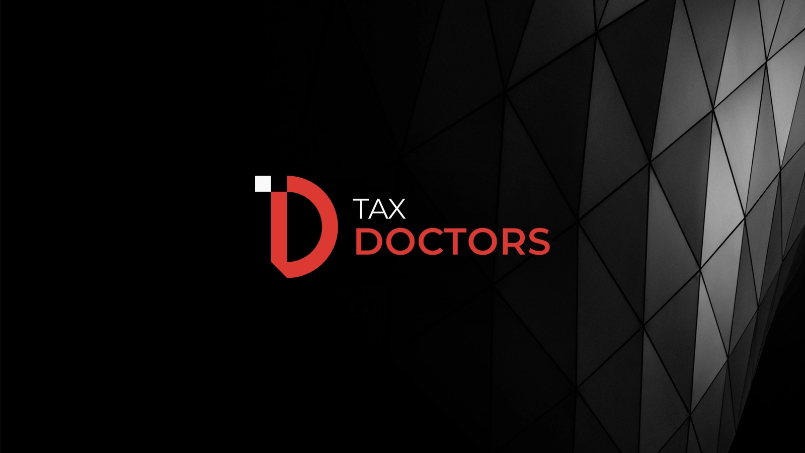
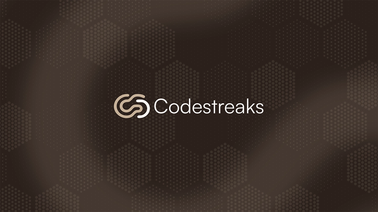
Codestreaks has a 24-unit grid. Every curve and angle is derived from it. The guidelines show the construction—how the mark is built, not only how it looks. TaxDoctor uses a grid for the D+T monogram. Pakalign Studio uses modular, grid-based geometry. Same idea: the grid is the logic. The logo is the output. When you see a mark that feels "right," often it's because it sits on a grid. Proportion. Balance. Repeatable. That's what makes it memorable—not the shape alone but the system behind it.
Clients searching "why does my logo look cheap" often have a mark that was drawn by hand without a grid. It's close. It's not precise. It doesn't scale with the same clarity. A construction grid forces decisions. Those decisions make the logo hold up at any size and in any application.
One Friction Moment
Early in my work I'd sketch a mark and digitize it. Sometimes it felt off. I couldn't say why. When I started building on a grid—Codestreaks was the first full grid-based system I shipped—the difference was clear. The mark felt intentional. So did every extension. Now I don't skip the grid. Why AI can't replicate a geometric brand is the proof: grids are human-built systems. Brand identity on this site is system-first. Work shows Codestreaks, TaxDoctor, Pakalign. Process is how we build it.