Why Your LinkedIn Banner Is Losing You Clients Before They Read Your First Word
Your banner is the first thing people see. Not your headline. Not your experience. The banner.
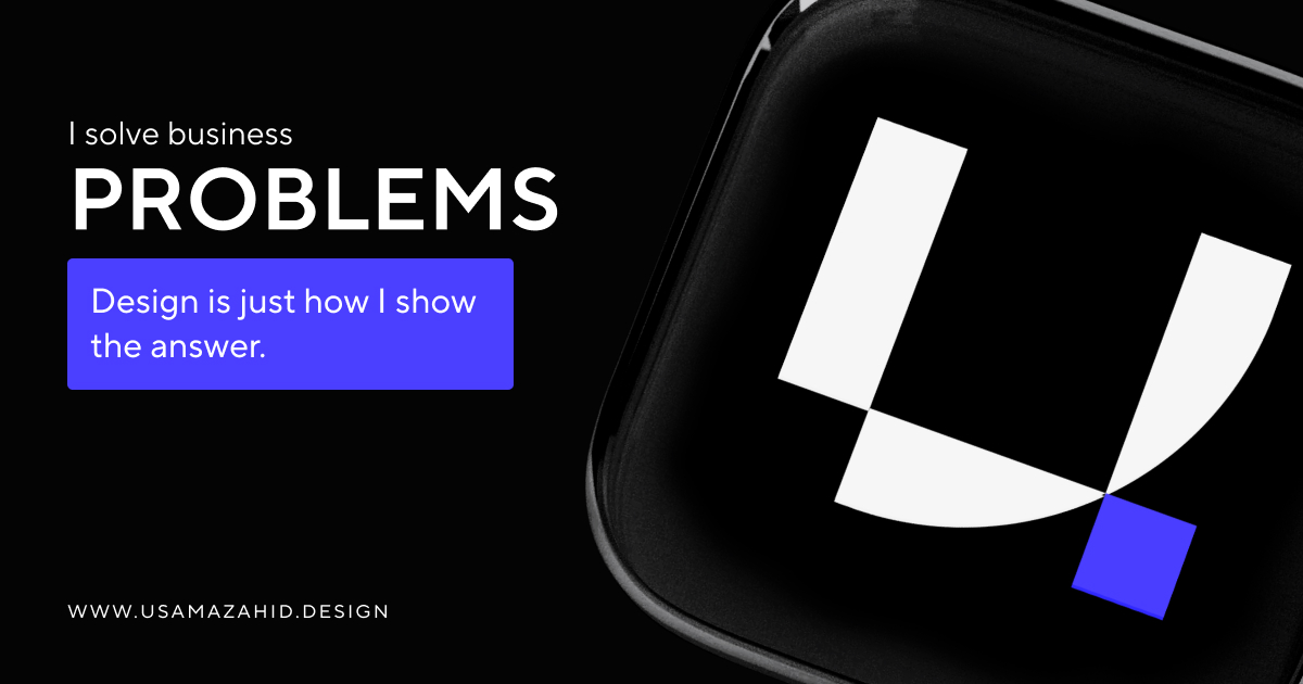
If it's stock, blurry, or off-brand, you're saying "I didn't invest in this." Clients and hiring managers notice. They don't always say it. They scroll. Or they don't. I've iterated on my own. The version that performs is clear, on-brand, and says one thing: who I am and what I do. No clutter. No "thought leader" fluff. One line. One visual.
The friction: my first banner was generic. A gradient. Some text. It looked like everyone else's. I replaced it with something that matched usamazahid.design—same tone, same clarity. No before/after A/B. But the profile feels coherent now. So does the rest of my presence.
One take: your LinkedIn banner is part of your brand. Treat it like a hero section. One message. One look. How to build a LinkedIn personal brand as a designer goes deeper. Branding and contact if you want it done for you.